All Activity
- Past hour
-
taller and taller
-
As he grew
-

What was your last very deliberate pen purchase?
sebastel23 replied to Misfit's topic in Fountain & Dip Pens - First Stop
After losing my wonderful black AL Sport at Malaga airport in 2020 (I overlooked it in the black box at the security check), replaced by a light blue AL Sport (sold in the meantime), followed by a raw aluminium version, I finally purchased a black one again. Why? Because the black one's surface has a unique touch to the fingers, that I found to be missing with the other ones. Cheers & happy writing, sebastian -

The Never-Ending Story In Three Word Segments...
jchch1950 replied to RMN's topic in The Write Stuff
he never knew -

Montblanc 75th Anniversary Limited Edition Skeleton Fountain Pen (1999) - Holy Grail Writing Instrument
a student replied to mosh_2k7's topic in Montblanc
This should give you a rough idea, give or take a few thousand, depending on how desperate the buyer or the seller are and whether the sale is a direct bilateral one or via a middle person https://www.bonhams.com/auction/24187/lot/93/montblanc-75th-anniversary-18k-gold-skeleton-limited-edition-75-fountain-pen/ and https://www.ebay.com/itm/371834095922?itmmeta=01HWA0SH2Y5DS8J6WVP07P9TDH&hash=item56930a0932:g:VnQAAOxyOBJRDxgf - Today
-
Taranis keeps leaking ink into the cap. Any ideas?
jchch1950 replied to Flaxmoore's topic in Sheaffer
Do you use a Cartridge or converter? -
What pen(s) are you waiting for in the mail?
jchch1950 replied to Sinistral1's topic in Fountain & Dip Pens - First Stop
A Penlux Grande in blue coi. -
Fountain pens getting more common?
jchch1950 replied to BambinoFortunato's topic in Fountain & Dip Pens - First Stop
We h We hope so. A growing market will be more tempting. -
What was your last very deliberate pen purchase?
jchch1950 replied to Misfit's topic in Fountain & Dip Pens - First Stop
54 g, posted or unposted? -
I have put an FPR ultraflex on a Konrad and carved the feed. My experience was that the feed did not keep up until I had radically carved the channel to be massive. I did a V shape that went extremely deep which may not be ideal but it did work. I might should have gone wider instead of that much depth. The FPR feed was too long for the Konrad so I carved the Konrad one. Drooling could be caused be a gap between the nib and feed which would be fixed by heat setting so that the nib and feed fit together well. I installed my nib and feed on the pen and dipped the nib and feed into just boiled water and gently pressed them together while it was hot. If once doesn't do it, do it again. The feed now keeps up with normal paced flex writing. If I do too much too fast it can dry up, but if I wanted to go faster I would carve the channel wider. I have decided not to do that because I don't want feathering on cheap paper. With an extremely carved up ebonite feed I have noticed that its not a pen that you want to carry around in your pocket. The feed when the pen is sitting around is WET and movement slings it into the cap. Walk around with it and there's going to be ink in the cap. Otherwise its fine at home. Hope that helps!
-
 Pandit Sahil Sharma Ji joined the community
 -

Majohn P139 on hand
Shanghai Knife Dude replied to Shanghai Knife Dude's topic in China, Korea and Others (Far East, Asia)
here you go. -
belated post here. Congratulations on doing such a wonderful job with the equipment you have. These are very nice and it sounds like you've headed in the direction that "you" wanted. There are a lot of YouTube Videos of high end european product and jewelry and fashion photographers, Yuri, etc, that you can get equipment and lighting setup ideas, as well as inspirations on your compositions. Suggest really take time to get your "iconic keepers" over taking a large number of shots that are throwaways. Wife and I have been commercial product and stock photographers ever since film. It is a demanding but rewarding genre of photography. Have fun with it. Up your gear as your skills improve as well. Though an investment, consider a full frame or aps-c sensor camera with proper lenses and lighting, and if you have the space, shoot "tethered" to a laptop or computer and use a very solid tripod and setup or lighting table. So you don't touch the camera. Also, learn to "focus stack" to control your depths, etc. The later and newer Olympus OM's do in camera focus stacking and finishing. If you have the budget, shoot raw and refine your post processing. Have fun. k
-
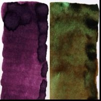
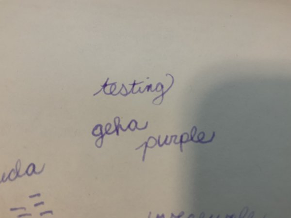
Vintage Pen-safe purple ink recommendations
Silly Party Candidate replied to Silly Party Candidate's topic in Inky Thoughts
I've already tried Waterman Tender Purple, and I was hoping for something a little darker and more subdued than that. -
@pen2deepA cursory internet search yielded a photo of a notebook of The Origin Collection in one colour — from this website: https://www.mens-folio.com/lifestyle/montblanc-meisterstuck-the-origin-collection-celebrates-100-years-of-the-meisterstuck/ One hopes, like the bracelets, cufflinks, and inks, that the notebook is also available in coral and green.

-
.thumb.jpg.b46946a50b0852aacffff5a0340d9841.jpg)
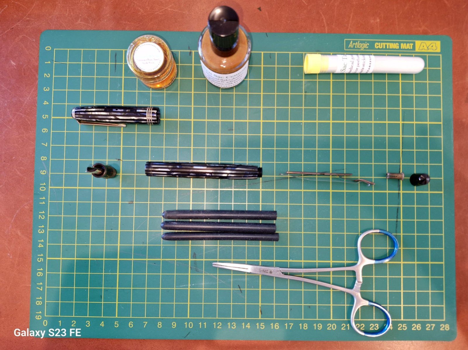
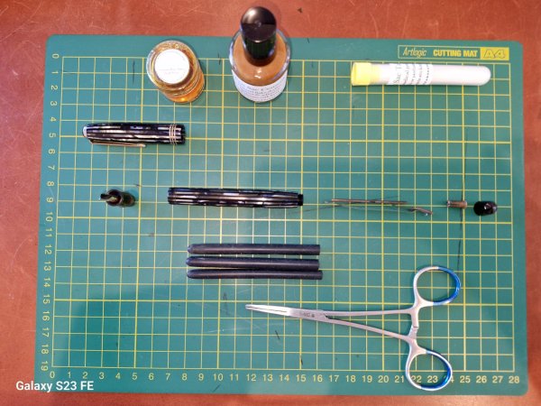
What pen(s) are you using today?
lionelc replied to A Smug Dill's topic in Fountain & Dip Pens - First Stop
parker striped duofold ef from 1941, just needed a quick ultrasonic clean and resac. parker washable blue. -
i do like 'em for their serviceability - the one in my photo is the opaque striped duovac, that ink window just has a view of the latex sac. opaque or translucent, it is a nice looking pen
-
Vintage Pen-safe purple ink recommendations
LizEF replied to Silly Party Candidate's topic in Inky Thoughts
While I haven't used it in a vintage pen, Waterman inks are generally considered super safe, so you could consider Waterman Tender Purple. -

Vintage Pen-safe purple ink recommendations
Penguincollector replied to Silly Party Candidate's topic in Inky Thoughts
Waterman Tender Purple is your best bet for a vintage pen. Mixing inks can be tricky, so I would avoid doing that with any vintage pen as precipitates can form and cause feed damage or clogging. Other than that- Pelikan, Diamine, and Herbin inks have been around forever and are generally safe.The only waterproof ink I have that I use in a vintage Waterman is Waterman’s Patrician Purple, a very old ink that is no longer made. -
@Toll Nice! I know the feeling, I usually stay at the intercontinental opera in Paris, and there is a MB boutique at street level. I haven’t seen the notebook yet, were there multiple colors/designs? I hope you’re enjoying Lisbon!
-
Hello, everyone. I think this might be the right place to ask this, I can't find anything else online or on this site that can answer my question. So, recently I managed to score a restored vintage pen for a decent price. Hasn't arrived yet, but I've been looking for a good purple ink to use it with. Originally I was planning to go with Noodler's La Reine Mauve, but... as I researched a bit more I realized that's a really, really bad choice to use here. I do really like the color though, so I was wondering if you guys can recommend me a good ink that looks similar to it (or just generally something that's not so bright and pinkish) that's also safe to use inside a vintage pen. Preferably waterproof, if that's even possible in this case. Willing to do something weird like mixing inks if that turns out to be the best option. Thanks
-
Your Most Recent Impulsive Ink Purchase? (Replacement Bottles Don't Count.. Only 1St Timers!)
pucipatas replied to MHBru's topic in Inky Thoughts
Birmingham Pen Company’s Interstellar Bronze, Tesla Coil, and Emerald Fusion. The emerald fusion pleasantly surprised me with the lovely sheen. -
Any idea how much original Wilkinson pen patents are worth, if anything at all?
-

Your Most Recent Impulsive Ink Purchase? (Replacement Bottles Don't Count.. Only 1St Timers!)
PithyProlix replied to MHBru's topic in Inky Thoughts
Here's what I got, in the swatch order as well as their order in the poem. Herbin Terre de Feu ("land of fire") identified by @Misfit Sailor Jentle Souten ("sky blue") Herbin Café des Iles ("island coffee") identified by @Misfit Daniel Smith Walnut, a dip pen ink that looks really wonderful to my eye Rohrer & Klingner 2021 LE Isatis Tinctoria, which @Mercian identified. I was thrilled to find this supposedly unobtainium - unfortunately it appears to be truly unobtainium now. Sailor Jentle Blue 😁 Kaweco Sunrise Orange Thanks @Misfit & @Mercian for playing along with my attempt at a little game! ------- Yesterday's impulsive purchase was NOS bottles (with boxes) of Montblanc Blue Black and Black, I believe from the 1950s. -
What pen(s) are you using today?
pucipatas replied to A Smug Dill's topic in Fountain & Dip Pens - First Stop
Inked up my gray Pilot Metropolitan CM with BPC Interstellar Bronze. -
 Curiousone11 joined the community
 -

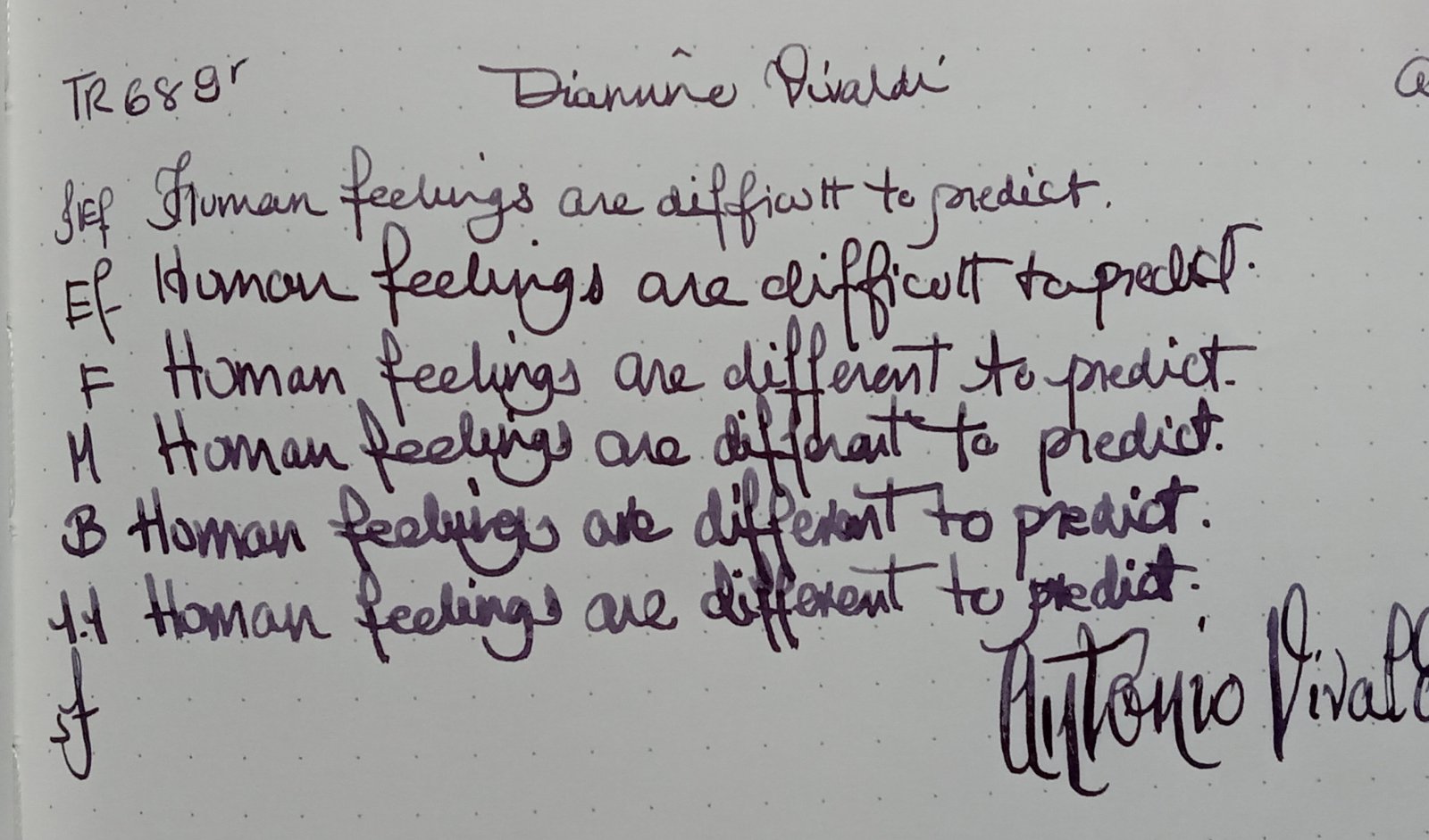
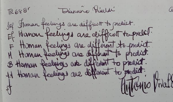
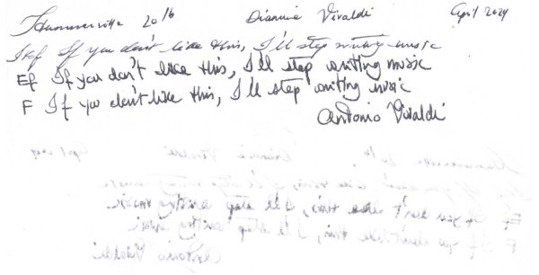
Critiques On My Handwriting?
arcfide replied to Irelaand's topic in Handwriting & Handwriting Improvement
I think you have a distinctive looking hand, and that's pretty good. If I were to pick one thing that is throwing off your writing, it would be the lower-case letters failing to adhere to the proportions and shapes of the letter forms. Your letters aren't consisten in spacing, proportion, and shape. When you write very "flat" like you are, it's very important that you retain the relative proportions of the letterforms in doing so, otherwise, you will lose the ability to recognize the individual letters. Imagine that you want to flatten out your letters as you do above; to do this while preserving the proportions, each letters must be "flattened" the same amount and the same way, meaning that you must scale each letter by the same amount in the x and y coordinates. There can be some minor adjustments afterwards, but the general rule applies. You also need to make sure that you can do so while retaining the important "signal points" of each letter which distinguishes one letter from another. The big ones I see right away in your writing are the r, s, n, m, u, and e. All of these letters start to look alike in your writing because you don't maintain the r's shape, the hook in the s, the curves in the n, m, and u, or the inner spacing in the e. This means that they all start to look the same when put next to one another. Some ways that I might adjust those would be to increase the x-height a little bit and write your letters a little taller. That will change the look of them a little bit, but it will make them more legible, especially with the width of the nib that you are using (and being a big fan of wet and wide nibs, I wouldn't ever suggest just using a finer nib!). For the r, which will be hard to get right unless you really practice at it at that size, I might switch to the "Palmer r" which was popular back in the day. Read one of the Palmer manuals on business writing or look at the terminating r form from Michael Sull's alphabet. Look at the second variation of lowercase r in the following image: After that, I'd make sure that you are keeping the space on the e, and working on the shapes of the m, n, and u. Another thing that can help if you don't want to keep your letters taller and more narrow is creating more space between each letter. When you write as flat as you are doing right now, legibility can be greatly improved by making the letters compact and then introducing wider than expected spacing between the letters. Here's an example of a taller and more narrow style: And here is an example of putting a little more space and having things a little flatter, but notice how the letters are still a little taller than yours: Michael Sull has a great variation which is a happy medium between these: At the full opposite end of the spectrum, you might have this, which is Smithhand: However, notice that in all of these examples,the shapes of each letter are fully distinct and proportionally consistent relative to each letter form.


-
Forum Statistics
352.3k
Total Topics4.6m
Total Posts -
Member Statistics
125,524
Total Members2,359
Most Online
-
Images
-
Albums
-

Ne
- By Penguincollector,
- 0
- 0
- 6
-
pen repair
- By lionelc,
- 0
- 0
- 1
-
March- April -2024
- By yazeh,
- 0
- 0
- 52
-
Misfit’s 4th album of Pens etc
- By Misfit,
- 99
-
Mercian’s Miscellany
- By Mercian,
- 0
- 14
- 22
-

-
Topics
-
-
Upcoming Events
-
-
Blog Comments
-
By Shanghai Knife Dude · Posted
I have the Sailor Naginata and some fancy blade nibs coming after 2022 by a number of new workshop from China. With all my respect, IMHO, they are all (bleep) in doing chinese characters. Go use a bush, or at least a bush pen. -
desaturated.thumb.gif.5cb70ef1e977aa313d11eea3616aba7d.gif)
By A Smug Dill · Posted
It is the reason why I'm so keen on the idea of a personal library — of pens, nibs, inks, paper products, etc. — and spent so much money, as well as time and effort, to “build” it for myself (because I can't simply remember everything, especially as I'm getting older fast) and my wife, so that we can “know”; and, instead of just disposing of what displeased us, or even just not good enough to be “given the time of day” against competition from >500 other pens and >500 other inks for our at -

By adamselene · Posted
Agreed. And I think it’s good to be aware of this early on and think about at the point of buying rather than rationalizing a purchase.. -
By A Smug Dill · Posted
Alas, one cannot know “good” without some idea of “bad” against which to contrast; and, as one of my former bosses (back when I was in my twenties) used to say, “on the scale of good to bad…”, it's a spectrum, not a dichotomy. Whereas subjectively acceptable (or tolerable) and unacceptable may well be a dichotomy to someone, and finding whether the threshold or cusp between them lies takes experiencing many degrees of less-than-ideal, especially if the decision is somehow influenced by factors o -
By adamselene · Posted
I got my first real fountain pen on my 60th birthday and many hundreds of pens later I’ve often thought of what I should’ve known in the beginning. I have many pens, the majority of which have some objectionable feature. If they are too delicate, or can’t be posted, or they are too precious to face losing , still they are users, but only in very limited environments.. I have a big disliking for pens that have the cap jump into the air and fly off. I object to Pens that dry out, or leave blobs o
-
-