All Activity
- Past hour
-
What pen(s) are you using today?
Penguincollector replied to A Smug Dill's topic in Fountain & Dip Pens - First Stop
I can picture it, lol. Sounds like a color I found at Five Below a couple of years back. -
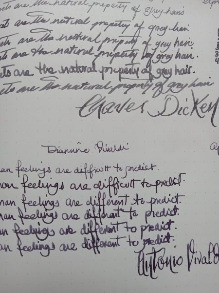
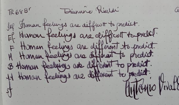
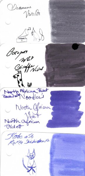
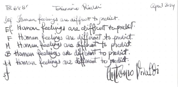
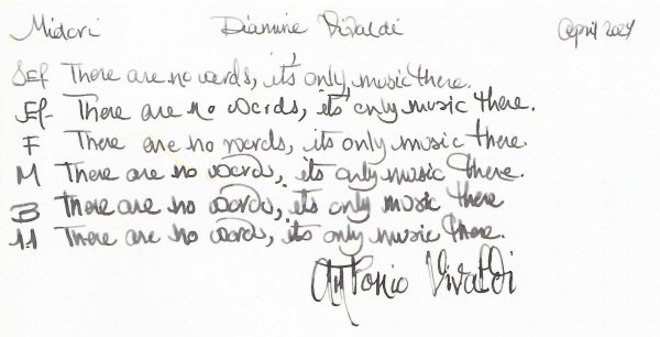
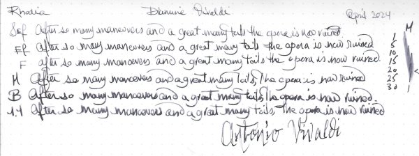
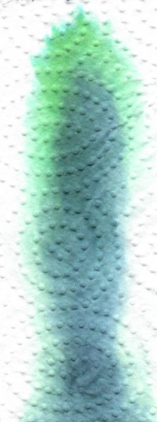
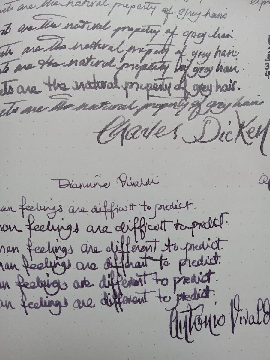
Diamine is dependable. Though, I believe it has been overshadowed by new brands with flashy bottles. This is on the same page with a grey ink I reviewed. In the photo they look distinct but to the naked eye, especially in low light they can be interchangeable You don't need to preach to the converted I've been listening to the series of Haydn Symphony Crusade videos , and have finally managed to slug through his early symphonies. Truly amazing music. I especially enjoyed the Ádám Fischer recordings (for the early ones). When I had to listen again to Vivaldi for this review, while I found his music enjoyable, in the end it was quite formulaic and repetitive, compared to Haydn's. But I guess the "wig" doesn't help. That was a major turn off for me as young music lover
-

The Never-Ending Story In Three Word Segments...
Kublai Khan replied to RMN's topic in The Write Stuff
-pal writing letters -
-
-

Your Most Recent Impulsive Ink Purchase? (Replacement Bottles Don't Count.. Only 1St Timers!)
Bo Bo Olson replied to MHBru's topic in Inky Thoughts
1 or 5 cents more expensive....so not cheaper than Octopus, or Amazon, but with a 5th ink I'd had free postage. I'll have to start a file for all these places in Germany to order stuff.... I lost the battle of trying to buy off line. -

Affordable Cream Colored Fountain Pen Paper/notebook?
cougarking replied to TitoThePencilPimp's topic in Paper and Pen Paraphernalia
Digbats are good quality, and do a good range with different size and style paper. Recommend both Earth and wildlife range! you should find them fine! -

What pen(s) are you using today?
Sailor Kenshin replied to A Smug Dill's topic in Fountain & Dip Pens - First Stop
The mechanism does work if the carts are long enough. You know the color of Clairefontaine and Rhodia lines, dots and grids? This cartridge is like a neon version of that, lol. -
 marioullis joined the community
 -
Your Most Recent Impulsive Ink Purchase? (Replacement Bottles Don't Count.. Only 1St Timers!)
RJS replied to MHBru's topic in Inky Thoughts
https://www.papierundstift.de are a better place to buy Octopus inks than Octopus- cheaper inks and free delivery over €59.99 in Germany. They sell quite a few inks at lower prices than other German stores. -
What Was Your Last Impulsive Pen Acquisition?
carola replied to lgbpinho's topic in Fountain & Dip Pens - First Stop
@Mercian I just love the idea of the English language acting as a waylayer. 🤣 And it is probably very much to the point, too. As cerveau and cerebellum is practically the same word, you have a point there, it's just some sound shift that got in your way. 😉 Ship and bateau on the other hand, are two completely different beasts, while ship obviously corresponds to German "Schiff". Fun fact: it's "das Schiff", which means it is neither male nor female, just plain neutral. So your question would have to be why English ships are female while their German counterparts are neutral. I have no idea. 🤷♀️ I won't debate English being pretty ambiguous either. I would however debate its lack of poetic capacity. Many German and Austrian bands prefer writing their songs in English, partly because everything sounds more "international" and partly (at least in my opinion) because lyrics you don't get away with in German sensewise still tend to sound like they have some sense in English. And as for your comparison between la mer and the sea, I think la mer sounds a lot more poetic to you because French is not your native language (although I will agree that la mer has indeed a very nice rolling quality). -

The Never-Ending Story In Three Word Segments...
I-am-not-really-here replied to RMN's topic in The Write Stuff
his missing pen -
What pen(s) are you using today?
Penguincollector replied to A Smug Dill's topic in Fountain & Dip Pens - First Stop
I’ll check it out- I have a ton of Chinese cartridges in both of the usual sizes. I was wondering about that, if it needed the converter as part of the clicker or not. Thanks! -
where he found
-
What pen(s) are you using today?
Sailor Kenshin replied to A Smug Dill's topic in Fountain & Dip Pens - First Stop
@Penguincollector, the clicky pens do take certain cartridges. I have some pale neon blurple that may or may not fit…. 😸 - Today
-
In fair Verona, where we set our scene
Penguincollector replied to sandy101's topic in Fountain & Dip Pens - First Stop
I’ve been fascinated by the celluloid Nettunos with a button filling system for some time now,so that’s my suggestion. I have yet to see one in person. -

What Was Your Last Impulsive Pen Acquisition?
TSherbs replied to lgbpinho's topic in Fountain & Dip Pens - First Stop
I think that you are just expressing your own bias/preference here, and not an actual measurement of some sort of quality(ies) you label "poetic resonance and potential." I am unclear how a reference to gender with so many genderized articles and nouns would be an increase in anything except, well, references to gender and excess of personification. (and I am not referring to the sounds of words and phrases, that is a whole different matter). The answer to your question in the parentheses is easy to look up in a search, and has little to do with the gender of cognates or borrowings from other languages. And the word "boat," in English, likely derives not from the French, but alongside the French, from earlier Germanic roots and PIE. -

Majohn P139 on hand
SLinkster replied to Shanghai Knife Dude's topic in China, Korea and Others (Far East, Asia)
I have not watched the video, possibly the answer to my question is contained therein. Any info yet on the ink capacity of either model (#6, #8)? -
Old style Pelikans with medallions. M800 1980-1990 Blue/ Green/Blue Ocean/ Black/ Green I got one and rest followed

-

Need Handwriting suggestions. Thanks everyone.
kealani replied to kealani's topic in Handwriting & Handwriting Improvement
This is great advice from a pro. A "lightbulb moment" to pay attention to and follow. huge thanks. k -
The Never-Ending Story In Three Word Segments...
I-am-not-really-here replied to RMN's topic in The Write Stuff
under the couch -
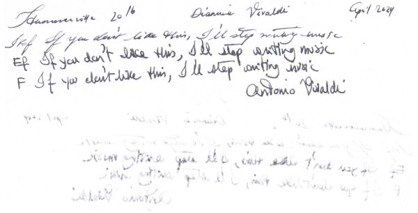
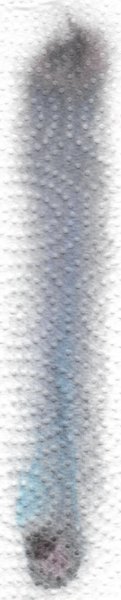
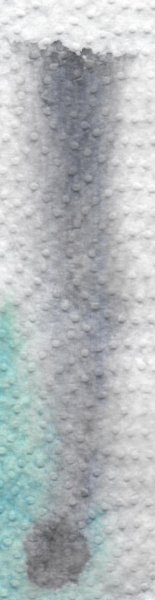
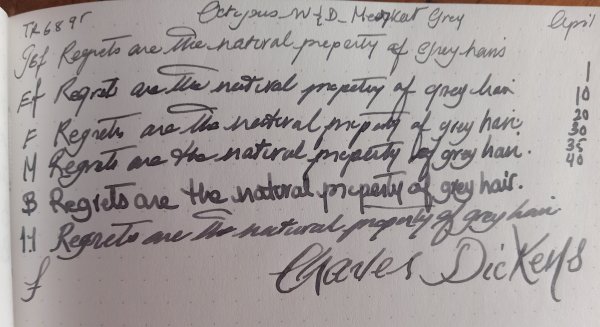
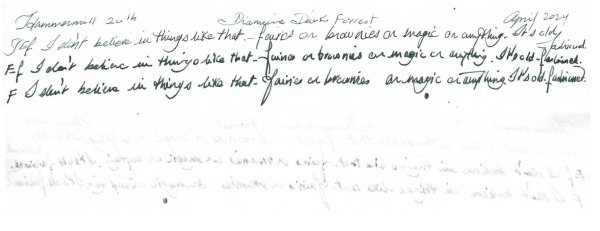
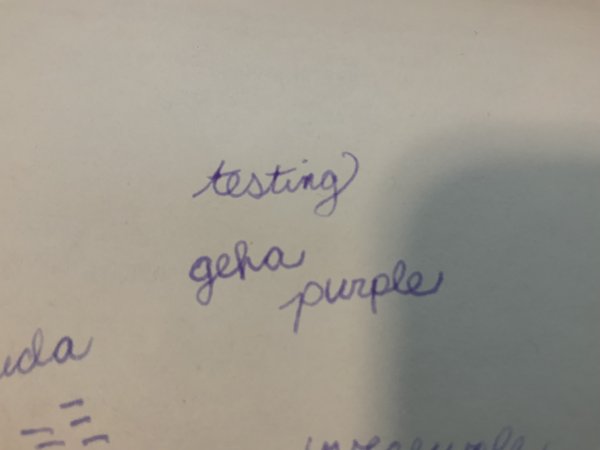
Thanks for such a great job at showing one of my favorite inks! Honestly, I didn't take Diamine that seriously until I got this one, mainly because all their inks I had tried up to that point - some of their most popular ones - were oversaturated and unsubtle for my tastes. Not sure if it is a violet or a grey. It doesn't really matter - it's something in between - many of the best inks live in the margins. My writing with it tends to be noticeably more violet than yours, even with the Japanese Fs I tend to use, but perhaps it is because those pens tend to be dryish. Or maybe it could the paper and/or atmospheric differences. Or 'mojo'? Right and, moreover, Haydn had much stronger ties to London and, moreover2, neither Mozart nor Beethoven are in the same league as Haydn - not even close! (Yep, you read correctly. 😲) I suppose it's much better he be left out than some inappropriate color be associated with him. BTW, I would pick an earthy brown since he was the salt of the earth as both a person and composer. Actually, I think the color on the wall in this portrait of him would be a perfect fit.
-
Very few of my pens behave perfectly, part of the fun the way i see it.
-
now could reach!
-
Maybe one should consider plan : D
-

What was your last very deliberate pen purchase?
sebastel23 replied to Misfit's topic in Fountain & Dip Pens - First Stop
i don't know either. at school, i had to battle Gerhart Hauptmann, and Heinrich von Kleist instead. as a result, I'd never consider to buy a pen wearing the name of one of these. back to the topic: on my way to the (deliberately chosen) black AL sport, I also bought (on an impulse) the piston sport ... -

Need Handwriting suggestions. Thanks everyone.
txomsy replied to kealani's topic in Handwriting & Handwriting Improvement
I suspect many a one confuses the spirit with the shape of the letters. You do not need any kind of nib to write any script. You may need a specific one to make it look calligraphic, but letter forms will work the same whether written with or without line variation. A nice thing of some italic methods is their stress on rhythm, which can make them somewhat easier if movement limited. No need to expend a lot on books either. I would suggest having first a look at Operina.com, they have a reasonable number of free books available on handwriting with easy to start methods. Plus the first published one that got the style rolling publicly, Arrighi's Operina. As for loops... that, too, depends on where one sets the bar for claiming 'italicity'. Soon after the first masters, new styles popped out extending serifs, adding ligatures and eventually loops. As for paper position... I find it similarly radicalized. For calligraphy, it may be better some or another approach, which I will not discuss. For plain handwriting, anything that makes you more comfortable will do. Looking at copy books through the ages, one can find masters suggesting all kinds of angles, even close to 90 degrees, specially where school tables had less space or masters were less rigid, more sensible and more accommodating with student needs. So, just try and see which one works better. Bottom line: for the OP. I guess that the most important is to find a style that suits your writing limitations, does not tire your hand, and then simply try to make it clear and consistent. Beautiful line variation shapes may come later if, and only if, you feel like them.


-
Forum Statistics
352.3k
Total Topics4.6m
Total Posts -
Member Statistics
125,526
Total Members2,359
Most Online
Newest Member
marioullis
Joined -
Images
-
Albums
-
March- April -2024
- By yazeh,
- 0
- 0
- 53
-
txomsy's quotes
- By txomsy,
- 0
- 5
- 82
-

Ne
- By Penguincollector,
- 0
- 0
- 6
-
pen repair
- By lionelc,
- 0
- 0
- 1
-
Misfit’s 4th album of Pens etc
- By Misfit,
- 99
-

-
Topics
-
-
Upcoming Events
-
-
Blog Comments
-

By Shanghai Knife Dude · Posted
I have the Sailor Naginata and some fancy blade nibs coming after 2022 by a number of new workshop from China. With all my respect, IMHO, they are all (bleep) in doing chinese characters. Go use a bush, or at least a bush pen. -
desaturated.thumb.gif.5cb70ef1e977aa313d11eea3616aba7d.gif)
By A Smug Dill · Posted
It is the reason why I'm so keen on the idea of a personal library — of pens, nibs, inks, paper products, etc. — and spent so much money, as well as time and effort, to “build” it for myself (because I can't simply remember everything, especially as I'm getting older fast) and my wife, so that we can “know”; and, instead of just disposing of what displeased us, or even just not good enough to be “given the time of day” against competition from >500 other pens and >500 other inks for our at -

By adamselene · Posted
Agreed. And I think it’s good to be aware of this early on and think about at the point of buying rather than rationalizing a purchase.. -
By A Smug Dill · Posted
Alas, one cannot know “good” without some idea of “bad” against which to contrast; and, as one of my former bosses (back when I was in my twenties) used to say, “on the scale of good to bad…”, it's a spectrum, not a dichotomy. Whereas subjectively acceptable (or tolerable) and unacceptable may well be a dichotomy to someone, and finding whether the threshold or cusp between them lies takes experiencing many degrees of less-than-ideal, especially if the decision is somehow influenced by factors o -
By adamselene · Posted
I got my first real fountain pen on my 60th birthday and many hundreds of pens later I’ve often thought of what I should’ve known in the beginning. I have many pens, the majority of which have some objectionable feature. If they are too delicate, or can’t be posted, or they are too precious to face losing , still they are users, but only in very limited environments.. I have a big disliking for pens that have the cap jump into the air and fly off. I object to Pens that dry out, or leave blobs o
-
-