Jump to content

All Activity

This stream auto-updates

  1. Past hour
  2. marlinspike

    100th Anniversary editions

    They will make far more money than I ever will by continuing to push themselves as a luxury "lifestyle" brand selling leather backpacks to those who came upon money too quickly or too easily, and then for good measure selling some high 5 and 6 figure pens to people who will use them as a form of contract kickback. I agree that limiting the marbling to the cap is good for the ballpoint, where the asymmetric design means the marbling helps improve the balance of the visual weight. However, to my eye the fountain pen and rollerball would do better to have the effect throughout. In Montblanc terminology, "platinum-coated" is 3 to 4 microns and gold-coated is 15 microns. I'm fine with both, but if they truly lacquered and aren't just badly describing enamel, the failure of the lacquer is a matter of when not if, and that's pretty bad at this price point.
  3. DimitriDiak

    100th Anniversary editions

    I think with the “Ink” effect on the resin caps Montblanc was going for a more delicate. understated design inspired by the different marbling effects of the early Meisterstuck, also updating the marbling of today’s production techniques. Personally I like the limited marbling effect to the cap it is very subtle (depending on the lighting) and contrasts well with the rest of the body. Otherwise the effect would have been blended into the pen and lost. Here are the details of the coatings: DOUÉ LEGRAND:  Platinum-coated with lacquered pattern. Laser-engraved vintage logo. Platinum-coated cap ring. DOUÉ CLASSIQUE & SOLITAIRE LEGRAND: Gold-coated with lacquered pattern. Laser-engraved vintage logo. Gold-coated cap ring.
  4. @mosh_2k7Thank you for this photographic unveiling sequence which makes puts us right in the middle of the action. A holy grail pen indeed! After more than three years of waiting, and possibly many more years of searching, your excitement and satisfaction at finally receiving this work of art is likely incalculable. I have always considered elaborate hand engraving to be part and parcel of a skeleton piece, as with desirable examples from vaunted horologists like Audemars Piguet, Patek Philippe, and Vacheron Constantin, and so far, to me, only this particular skeleton pen model in Montblanc’s vast and variegated pen portfolio properly fits the bill. What a rarified and exceptional pen! My hearty congratulations to you on its acquisition!
  5. Today
  6. inkstainedruth

    What pen(s) are you using today?

    Interesting. I vaguely remember learning about the Fibonacci series in some math class in high school, but had to look it up to double check that I remembered what it was *correctly* Ruth Morrisson aka inkstainedruth
  7. PithyProlix

    Rohrer & Klingner Isatis Tinctoria (2021 LE)

    As of now, two bottles, thought to be unobtainium, are available here: https://www.artemiranda.com/gb/rohrer-klingner-schreibtinte-calligraphy-ink-special-colours-limited-edition/29080 Please leave a comment if you nag the last bottle so this isn't a frustrating tease to others!
  8. Yes Sterling Silver. Beautiful pen. The Grifos rep I talked to at the Arkansas Pen Show explained that the pen was named the Gaudi because Gaudi was the mathematician that developed the Fibonacci series and they used the Fibonacci series as the settings on the Guilloche machine to create the spiral pattern! Makes the pen even cooler to me!
  9. NoType

    100th Anniversary editions

    @marlinspike You seem to have an artist’s eye for detail, materiality, and colour, which Montblanc could definitely benefit from.
  10. Correct on both! The first (and last) is Terre de Feu, "land of fire". Correct on the fifth ink! (See my forthcoming comment in @namrehsnoom's review about where a bottle of this unobtainium might be found.) Oh, I cannot agree! It's a blue with a little difference, making it interesting to my eye. Sort of a slightly feminine counterpart to Diamine Prussian Blue.
  11. A Smug Dill

    Sailor has a new pen: TUZU!

    With the Japanese yen being so low — dropping yesterday (and today further) below AUD $1.00 for ¥100 for the second time this month — the Sailor Tuzu is looking firmer and firmer on my to-buy list when I go to Osaka next month.
  12. They do have a Double Broad and an Italic Broad for the 800.
  13. Thank YOU and it looks great. I grabbed a screen shot and enlarged it in "Paint" so that I could see it more clearly. Really nice! Wishing you lots of enjoyment with this pen and nib.
  14. Amazing pen. I came across a resin 149 75th anniversary a few years back at a really good price but for some reason passed on it. One of the few times I regret not buying a pen.
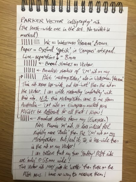
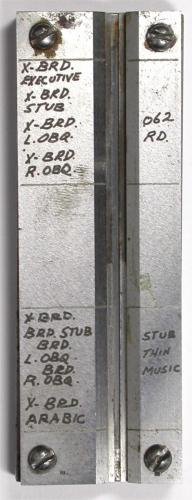
  15. I'm happy to share. 😊 If it is not fruitful, I hope it is at least fun! You mentioned that your writing is on the smaller side. I, too, appreciate having the option to write tiny. With that in mind, I'll suggest you take a look at Pilot's CM nib, which is found on some Plumix, Metropolitan, and Prera pens. They are dry nibs. If you want a smoother experience, the 1.1mm stub on the Monteverde MVP (a #5 Jowo nib, I believe) loses the dry feel while still providing a thinner-than-average 1.1 line. The old school Sheaffer No Nonsense Fine Italic nibs create relatively thin and crisp lines, but their edges are unforgiving when compared to the stubs above. They're no longer manufactured so you have to buy on the used market, probably from India. Sheaffer's current entry-level calligraphy sets might be just as good but I don't know. Lastly, Birmingham Pens offers Nemosine #6 0.6mm and 0.8mm stubs, but are currently out of stock. I have yet to try them but FPN seems to think highly of them and I am looking forward to giving them a try. There are other good (and more accessible) options, but the above are the thinnest that I know about.
  16. penwarrior32

    What pen(s) are you using today?
    Yes. Very clingy!!!!! Cheers mate.
  17. Mercian

    Mercian’s Miscellany

    As the album's name suggests, a miscellany. Some pen-related items; some not.
  18. marlinspike

    100th Anniversary editions

    Interesting to hear this about the older ones. It's on none of my older ones, but I pretty much never see a new one without it recently. I can't think of a single fountain pen reviewer who has any idea on how to judge jewelery (which actually is what fine writing is, at this price point for what you're getting it should be van cleef level). Mostly it's just a bunch of ooing and ahhing, and if they do say anything negative it will be about how it doesn't post or too many turns to uncap or some other thing that completely misses the point. Personally, I think these are a much better effort than the 75th and 90th, but they should have marbelized all the plastic for the full plastic ones (yes, I realize then they can't use the same barrel as the doue, but at this price point they shouldn't worry about that) and I really hope they mean to say enamel when they say the doue have lacquer on the caps. I also think the tone of gold and coral they use don't pair well. Maybe their champagne gold would have but hard to say without seeing it done.
  19. That's true, I only used the cartridge because I'am still waiting on various ink bottles I have ordered online. I definitely look forward to using interesting ink colours but for now the cartridge will suffice. Thanks for your in depth advise and recommendation.
  20. As far back as my first trip to England 27 years ago I remember asking my dad why we get so many fewer pounds for our dollars only to have to give the same number of pounds for things as we do dollars. That said, I fermenter Germany being more expensive than the USA too and now things are much cheaper there, even groceries.
  21. Yesterday
  22. Last weekend I got to try a Kaweco sport for the first time. Just one sentence written with it mind you. I liked it so much I came home and ordered two of them. One medium and one broad. The broad was a mistake. It was supposed to be a fine but I screwed up when I placed the order. But it sure was a lucky mistake. I’d been wanting my first broad anyway. 🤣 These things write like a dream! As good or better than some rather expensive pens.
  23. Hello, I work with a lot of historical handwriting from the Victorian and Edwardian period and I am looking for a workbook or practice book from that era. I am not really looking for any fancy Copperplate or Spencerian scripts. As a historian, I have seen the handwriting of at least a hundred different people from the era, mostly British royalty and politicians, and I rarely if ever see anything closely resembling those scripts being used in their correspondence. Should I try Vere Foster?
  24. TSherbs

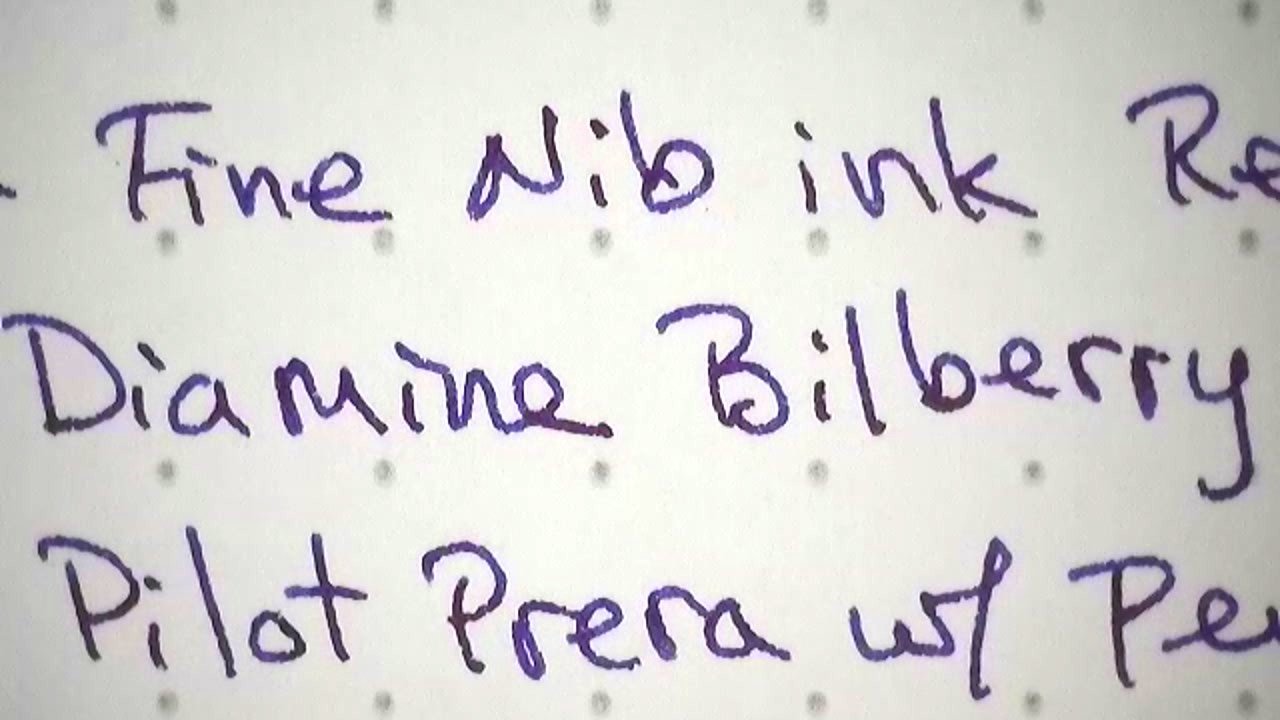
    Pilot Prera Medium Review

    I miss my Prera. Gonna ink it up again....
  1. Load more activity


×
×
  • Create New...