All Activity
- Past hour
-

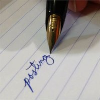
Critiques On My Handwriting?
arcfide replied to Irelaand's topic in Handwriting & Handwriting Improvement
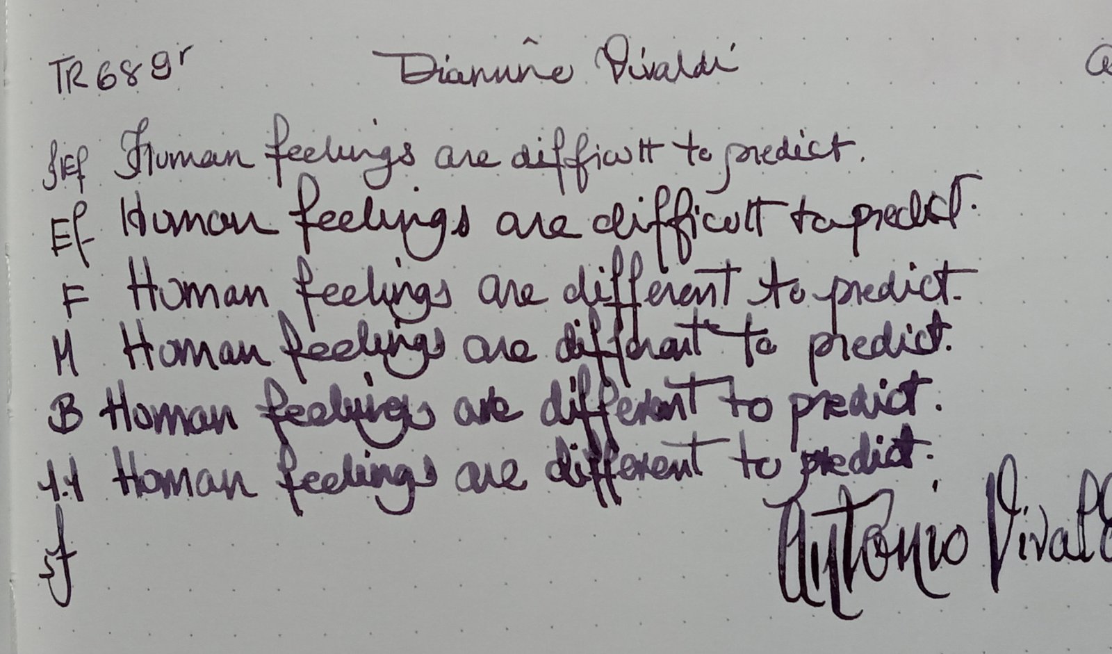
I think you have a distinctive looking hand, and that's pretty good. If I were to pick one thing that is throwing off your writing, it would be the lower-case letters failing to adhere to the proportions and shapes of the letter forms. Your letters aren't consisten in spacing, proportion, and shape. When you write very "flat" like you are, it's very important that you retain the relative proportions of the letterforms in doing so, otherwise, you will lose the ability to recognize the individual letters. Imagine that you want to flatten out your letters as you do above; to do this while preserving the proportions, each letters must be "flattened" the same amount and the same way, meaning that you must scale each letter by the same amount in the x and y coordinates. There can be some minor adjustments afterwards, but the general rule applies. You also need to make sure that you can do so while retaining the important "signal points" of each letter which distinguishes one letter from another. The big ones I see right away in your writing are the r, s, n, m, u, and e. All of these letters start to look alike in your writing because you don't maintain the r's shape, the hook in the s, the curves in the n, m, and u, or the inner spacing in the e. This means that they all start to look the same when put next to one another. Some ways that I might adjust those would be to increase the x-height a little bit and write your letters a little taller. That will change the look of them a little bit, but it will make them more legible, especially with the width of the nib that you are using (and being a big fan of wet and wide nibs, I wouldn't ever suggest just using a finer nib!). For the r, which will be hard to get right unless you really practice at it at that size, I might switch to the "Palmer r" which was popular back in the day. Read one of the Palmer manuals on business writing or look at the terminating r form from Michael Sull's alphabet. Look at the second variation of lowercase r in the following image: After that, I'd make sure that you are keeping the space on the e, and working on the shapes of the m, n, and u. Another thing that can help if you don't want to keep your letters taller and more narrow is creating more space between each letter. When you write as flat as you are doing right now, legibility can be greatly improved by making the letters compact and then introducing wider than expected spacing between the letters. Here's an example of a taller and more narrow style: And here is an example of putting a little more space and having things a little flatter, but notice how the letters are still a little taller than yours: Michael Sull has a great variation which is a happy medium between these: At the full opposite end of the spectrum, you might have this, which is Smithhand: However, notice that in all of these examples,the shapes of each letter are fully distinct and proportionally consistent relative to each letter form. -
If You Could Only Choose One Ink for a Lifetime...
langere replied to 2ouvenir's topic in Inky Thoughts
I have used Noodler's Legal Lapis in the past, but over the years it has turned into more of a teal color. I was thinking Blue/Black, but it's really more teal... Erick -

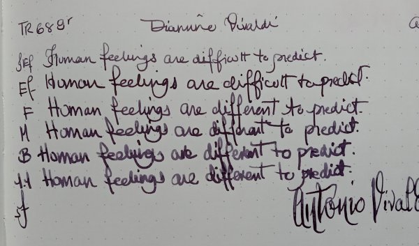
Montblanc 75th Anniversary Limited Edition Skeleton Fountain Pen (1999) - Holy Grail Writing Instrument
NoType replied to mosh_2k7's topic in Montblanc
@penwarrior32But understandable. Montblanc retains the 75th (and last-produced) example of this mod 75100 Skeleton 149 (75|75), and their archivist admitted that no one at Montblanc is allowed to ink it. As there are only 73 other examples of the mod 75100 Skeleton 149, the OP will have their work cut out for them in finding another that is already inked and used. But since the OP has found one, albeit unused, it is possible they may succeed . . . -

Montblanc 75th Anniversary Limited Edition Skeleton Fountain Pen (1999) - Holy Grail Writing Instrument
penwarrior32 replied to mosh_2k7's topic in Montblanc
@NoType Got it. Thanks mate. A pity. -
@MercianFunnily enough, the local Montblanc boutique sales manager, who was recently promoted to boutique manager, made this exact point when asked about sample writing paper, and then went so far as to produce their personal pad of Clairfontaine Triomph A5 blank paper in order for me to test different nib widths. I happen to have collected Meister-Būtten Handmade Paper, including mod no 10016 refill of 100-pack sheet paper (qty: 12); mod no 10017 refill of 30-pack cards (qty: 6); mod no 10018 refill of 100-pack envelopes (qty: 12); mod no 31100 presentation case of 5-pack cards, 15-pack envelopes, and 15-pack sheet paper (qty: 7); and mod no 31200 presentation case of 5-pack cards, 20-pack envelopes, and 20-pack sheet paper (qty:54) — all with beautiful texture and deckle edges, and all outperformed for fountain pen use by my HP Premium32 32# laser print paper, to say nothing of product by brands like the aforementioned Clairefontaine, Black & Red Oxford, Crane & Co, Dempsey & Caroll, Fritz Schimpf Feinpost, Maruman, Midori, Original Crown Mill, Rhodia, Smythson, Thornwillow, Twin Rocker, Wren Press, etc, etc. Meister-Bütten Handmade Paper has long been discontinued, unsurprisingly, but regarding current production, Montblanc’s leather-bound notebooks accompanying various pen models also suffer from inconsistent paper quality across different notebook types, between notebooks of the same type, and even within an individual notebook. Suffice to say, bringing one’s own paper to a Montblanc shop when looking at their pens is a wise decision! Please let us know how you get on.
-

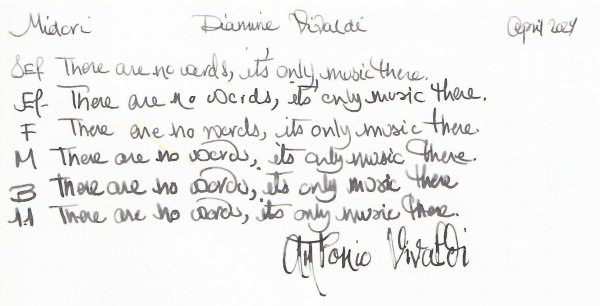
Are four pen widths the optimal for a pen nib for the body of letters?
PhiloPlume replied to PhiloPlume's topic in Handwriting & Handwriting Improvement
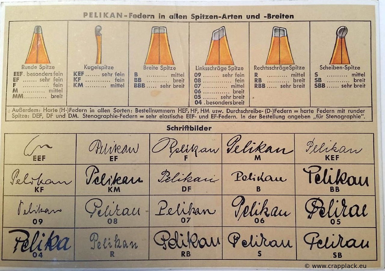
Okay. I knew I had to have not come up with this topic out of no where! I must have read something or watched something related at some point in time 🙂 I am a little surprised David didn't call me on this as Lloyd Reynolds is one of his mentors (and he is no doubt sick of me!) 🙂 Page 12 of his "Italic Calligraphy and Handwriting" book, which is the one that I carry and read and study and practice from almost every day. At the bottom of the page, last paragraph reads: "The medium guide line sheet is here recommended for use with the broad nib, because it is customary in rapid personal writing to use a scale of four pen widths instead of the more formal scale width scale of five widths". So put that in your pipe! 🙂 -
I recently acquired an MB 32p and when I used a Paper Mate branded converter from the 1980s (came in a German made slim stainless FP I bought in Jr. High school) in it the converter is too long to allow the barrel to screw down without the converter being under significant compression. The converter in question appears to be a Schmidt K5, just like pretty much every other European pen makers' branded converters (excepting of course the imprinted brand name on the metal ring). Does anyone here know if there's a go/no-go list of which converters fit these older MB cartridge pens acceptably? BTW, the barrel screws down on a pair of cartridges with only a hint of resistance at the end, probably just barely sufficient to pierce a cartridge if two sealed carts are inserted in the barrel. In light of that result, I'd estimate that this converter is at *least* .5mm longer than a pair of carts... Thanks!
-
 Silly Party Candidate changed their profile photo
 -

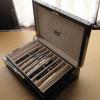
What Was Your Last Impulsive Pen Acquisition?
Gloucesterman replied to lgbpinho's topic in Fountain & Dip Pens - First Stop
Thank you. I was a bit surprised when I first held and used it. It was expected to be fairly heavy and it was not (un-posted, at least. And it writes quite smoothly too. -
 Marina1998 joined the community
 -

What Was Your Last Impulsive Pen Acquisition?
JonSzanto replied to lgbpinho's topic in Fountain & Dip Pens - First Stop
Thanks! It is possibly misleading, as I’m not certain it was meant to be entirely transparent. A few pens companies back then had similar sections: the front grip area was painted black, leaving a clear ink window on the rear portion. Congratulations, that’s an iconic pen. -

What pen(s) are you using today?
Penguincollector replied to A Smug Dill's topic in Fountain & Dip Pens - First Stop
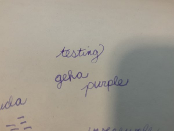
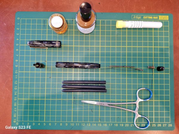
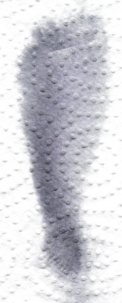
Today I inked up an EF pastel purple Chinese clicky pen that @Sailor Kenshin sent me with reconstituted Geha Purple (or Violett). I also used my glass pen for swatches, and my 1928 jade Lady Duofold. - Today
-
desaturated.thumb.gif.5cb70ef1e977aa313d11eea3616aba7d.gif)
Recommendation request: replacement for Aurora Black ink
A Smug Dill replied to brokenclay's topic in Inky Thoughts
That Sakae TP press release covers multiple products, including both 160-page and 96-page ‘Soft cover note’ notebooks. -
Thank you for letting me know that! I am thinking of visiting my nearest one soon, so I will make sure to take some good paper with me! Really though, one would rather expect that a vendor of ‘luxury goods’ that include fountain pens to spend the tiny bit of money to have fountain-pen-friendly paper in its stores! 🙄 I mean, how else are they going to ‘show-off’ their own ‘luxury’ inks? Idiocy!
-
Montblanc 75th Anniversary Limited Edition Skeleton Fountain Pen (1999) - Holy Grail Writing Instrument
NoType replied to mosh_2k7's topic in Montblanc
@penwarrior32The OP answered this question upthread. -
@MercianMontblanc boutiques have a reputation of stocking sample writing paper that exhibits feathering and other undesirable effects when subjected to the nib of a fountain pen, yielding unreliable line width comparisons.
-
Montblanc 75th Anniversary Limited Edition Skeleton Fountain Pen (1999) - Holy Grail Writing Instrument
penwarrior32 replied to mosh_2k7's topic in Montblanc
Wondering how is the writing experience. Do you intend to ink the pen? Beautiful pen!!! -
@marlinspikeI must confess that as an enthusiast of Vacheron Constantin, and an admirer of their vintage ultrathin skeletonised manual calibre 1003 and automatic calibre 1120, I have never been seduced by Montblanc’s watches, save for their aforementioned 1999 skeleton model. But it is good to know that negotiation for Montblanc watches is possible, knowledge which might come in handy were I to consider gifting a pen-and-watch combination for a Montblanc connoisseur.
-

Recommendation request: replacement for Aurora Black ink
XYZZY replied to brokenclay's topic in Inky Thoughts
Indeed! For some reason I thought the were 80 or 90 pages, not sheets. Thank you! -
In terms of actual sales I believe the pen has always been worth a fair bit more than the watch. The best thing about Montblanc watches is if you can find the one you want at a seller who wants it gone within 1 year, you can get a great price.
-
Ah, Visakhapatnam! Site of yet another, er, glorious recent performance by the England cricket team 😁 35 degrees Centigrade, while being too hot for me to feel comfortable, should not be hot enough to threaten the plastic of a Parker 45’s grip section. But I would still advise you to not leave one in a parked car on a hot summer day!
-
Montblanc 75th Anniversary Limited Edition Skeleton Fountain Pen (1999) - Holy Grail Writing Instrument
NoType replied to mosh_2k7's topic in Montblanc
@da vinciNot to mention that it is, to date, the only skeleton pen model by Montblanc with such a delicately thin metal overlay to better showcase every other engraved metal surface on the pen. -

What Was Your Last Impulsive Pen Acquisition?
Mercian replied to lgbpinho's topic in Fountain & Dip Pens - First Stop
Well, English has Celtic, Brithonic, Latin, Old German, Danish/Old Norse, Norman French, Dutch, middle German, and now Bengali, Hindi, Urdu, and Patois elements. There are undoubtedly some others that I’ve forgotten. The odd smatterings of Persian and Greek and Arabic for example. I reckon it ain’t just our Celtic maternal lines that were, er, happy to give a warm welcome to (& learn enjoyable tricks from) exciting new tongues…. -
Isn’t kanwrite shipping from USA now?
-
Just asking people here in Vizag causes them to say a 2 rupee pen is better or 0.024 dollars. But it is definitely not 50 degrees here it’s around 35 ish
-

What Was Your Last Impulsive Pen Acquisition?
ParramattaPaul replied to lgbpinho's topic in Fountain & Dip Pens - First Stop
Are you insinuating that our ancestral Celtic mothers 'slept around'? -
The Duofold Vacumatic pens (aka ‘Duovacs’), with the transparent material between the coloured celluloid stripes are, IMO, some of the prettiest pens ever made!


-
Forum Statistics
352.3k
Total Topics4.6m
Total Posts -
Member Statistics
125,522
Total Members2,359
Most Online
Newest Member
Marina1998
Joined -
Images
-
Albums
-

Ne
- By Penguincollector,
- 0
- 0
- 6
-
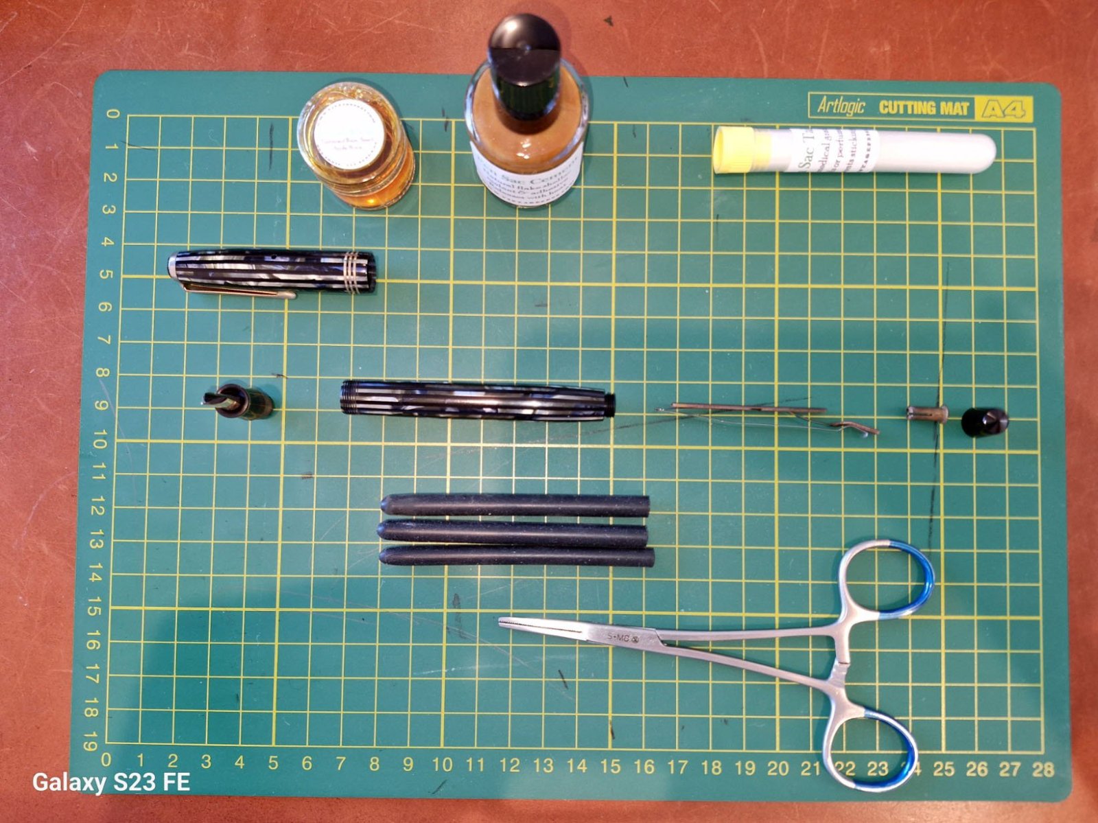
pen repair
- By lionelc,
- 0
- 0
- 1
-
March- April -2024
- By yazeh,
- 0
- 0
- 52
-
Misfit’s 4th album of Pens etc
- By Misfit,
- 99
-
Mercian’s Miscellany
- By Mercian,
- 0
- 14
- 22
-

-
Topics
-
-
Upcoming Events
-
-
Blog Comments
-

By Shanghai Knife Dude · Posted
I have the Sailor Naginata and some fancy blade nibs coming after 2022 by a number of new workshop from China. With all my respect, IMHO, they are all (bleep) in doing chinese characters. Go use a bush, or at least a bush pen. -
By A Smug Dill · Posted
It is the reason why I'm so keen on the idea of a personal library — of pens, nibs, inks, paper products, etc. — and spent so much money, as well as time and effort, to “build” it for myself (because I can't simply remember everything, especially as I'm getting older fast) and my wife, so that we can “know”; and, instead of just disposing of what displeased us, or even just not good enough to be “given the time of day” against competition from >500 other pens and >500 other inks for our at -

By adamselene · Posted
Agreed. And I think it’s good to be aware of this early on and think about at the point of buying rather than rationalizing a purchase.. -
By A Smug Dill · Posted
Alas, one cannot know “good” without some idea of “bad” against which to contrast; and, as one of my former bosses (back when I was in my twenties) used to say, “on the scale of good to bad…”, it's a spectrum, not a dichotomy. Whereas subjectively acceptable (or tolerable) and unacceptable may well be a dichotomy to someone, and finding whether the threshold or cusp between them lies takes experiencing many degrees of less-than-ideal, especially if the decision is somehow influenced by factors o -
By adamselene · Posted
I got my first real fountain pen on my 60th birthday and many hundreds of pens later I’ve often thought of what I should’ve known in the beginning. I have many pens, the majority of which have some objectionable feature. If they are too delicate, or can’t be posted, or they are too precious to face losing , still they are users, but only in very limited environments.. I have a big disliking for pens that have the cap jump into the air and fly off. I object to Pens that dry out, or leave blobs o
-
-