Jump to content

Waterman Overlays: photos of the variations


curioti

Recommended Posts

QM2,


In the time since you wrote that review, your flex hand has improved a hundredfold. Really beautiful.


Thanks : ) That disaster of a sample in my review was my first time using flex. Took me a while, but finally it's no longer a 4-letter word!


Link to comment
Share on other sites

  • Replies 42
  • Created
  • Last Reply

Top Posters In This Topic

  • QM2

    11

  • Vintagepens

    9

  • Pensee

    8

  • david i

    3

Top Posters In This Topic

Posted Images

If I try to remember where I first heard/saw a reference to "jasmin," I believe it was an article in the WES Journal. Henry Simpole -- a maker of silver overlay pens who created a replica of the design -- refers to it as well. Aside from this, I am certain I have heard the term used at (American) pen shows, but cannot recall specific sources/people. Whether it is regional or not I am not certain.


I would then think it most likely that the name was applied by Henry to his own overlays, and then retroactively applied by others to the Watermans that Henry was copying.


The term may indeed be current in collecting circles which I do not frequent. I can say with some assurance, though, that the term is surely relatively new if I have not previously run across it in some 20 years of active international dealing and collecting.

Link to comment
Share on other sites

If I try to remember where I first heard/saw a reference to "jasmin," I believe it was an article in the WES Journal. Henry Simpole -- a maker of silver overlay pens who created a replica of the design -- refers to it as well. Aside from this, I am certain I have heard the term used at (American) pen shows, but cannot recall specific sources/people. Whether it is regional or not I am not certain.


I would then think it most likely that the name was applied by Henry to his own overlays, and then retroactively applied by others to the Watermans that Henry was copying.


The term may indeed be current in collecting circles which I do not frequent. I can say with some assurance, though, that the term is surely relatively new if I have not previously run across it in some 20 years of active international dealing and collecting.


Than I shan't use it, so as not to mislead people. It is pretty funny though, how these things happen.

Link to comment
Share on other sites

So the pattern I just took to calling "art deco" is Jasmin. Cool. Always helps to have a more specific term.


But the Morrison steals the show!


So much to learn... Didn't even know about that make, but what a beauty. Must be a dream to write with?


Thanks! Morrison was a lower-tier manufacturer, and their overlay is noticeably thinner than the overlay of the big manufacturers. Still, some of the pens are very good quality, and they can be had at good prices. Mine came with a very flexible nib that is wonderful to write with!


I have a review of this pen here, written shortly after I got it:


Nice review but of equal interest is what others have already complimented you on-- improvement in writing with a flex nib.


I'm glad it's not just me! Learning curve here, but believe I'm finally putting 2&2 together as far as direction & what nib will do as far as line variation.


"There is hope!"


Anyway, thanks again for reply.


If I try to remember where I first heard/saw a reference to "jasmin," I believe it was an article in the WES Journal. Henry Simpole -- a maker of silver overlay pens who created a replica of the design -- refers to it as well. Aside from this, I am certain I have heard the term used at (American) pen shows, but cannot recall specific sources/people. Whether it is regional or not I am not certain.


I would then think it most likely that the name was applied by Henry to his own overlays, and then retroactively applied by others to the Watermans that Henry was copying.


The term may indeed be current in collecting circles which I do not frequent. I can say with some assurance, though, that the term is surely relatively new if I have not previously run across it in some 20 years of active international dealing and collecting.


David, you & other folks here are probably going to get tired of all my questions. So I thank everyone for being so patient & taking take to reply.


Three more questions & then I'll try not to overstay my welcome.


1.) What is significance of silver looking 'star' brand nib? This is only #2 nib I've been able to locate & it costs #125! I could (and just did) buy an entire *pen* for that price!


2.) Is 'pansy panel' a recognized term? Came across it while looking for nibs.


http://www.avalonpens.com/Avalon-Pens/vfp.html


3.) Meanwhile I finally heard back from repairman & would appreciate any advice here.


I don't have this 'ivy' pattern & filigree looks about as well preserved as that on the '12' & 452 I have.


But... Nib unit has bite marks on it, the original 'dome' is missing & clip would have to be replaced by a 'reproduction'.


So as far as pen being part of a collection-- is it worth sinking $225 into, or write it off as lesson learned when buying 'mechanics specials' off e-bay.


thx


--Bruce

Link to comment
Share on other sites

First, let me announce that I've posted the beginnings of a Pen Profile on Waterman overlay patterns. So far it covers only the "Filigree" patterns, and I need to add more illustrations and detail on the fine silver examples. I'll be adding to it as time permits.


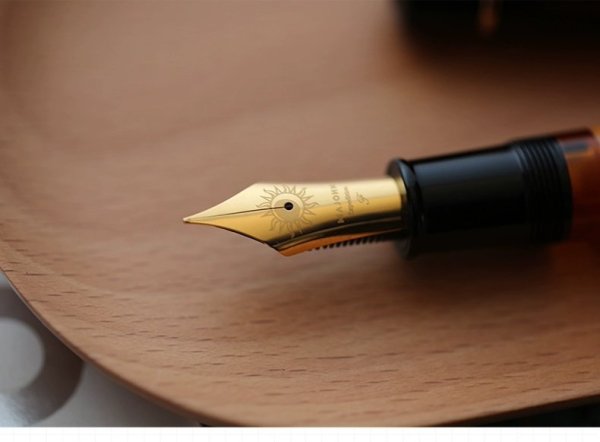
What I believe you are referring to is a Waterman nib with a star imprint. Although some make a big deal of them being exceptionally rare, I would say only that they are scarce. Nearly all, however, are #2 size -- any examples in other sizes would indeed be rare. It's not clear when the star-imprint nibs were made or what the star indicated. Rough dating would place them right around the turn of the century. The star might well have denoted nibs from a particular subcontractor, perhaps Fairchild (since Fairchild did use star-shaped vent holes on their own branded nibs).


Pansy Panel is one of the Waterman overlay patterns. It comes in numerous variants, all of which consist of engraved floral or vegetal patterns in panels defined by longitudinal lines.


As for the project pen, I don't think the $225 quote is at all unreasonable for the work required. At the same time, I don't think it's worth putting that much money into the pen, especially if you are going to end up with a non-sterling clip. Better wait to see if you can find a matching pen with a bad barrel at a low price.

Link to comment
Share on other sites

Wonderful, thanks for that!


I had not realised that the design the name of which was under discussion here came in two different proportions; good to know. I have also never seen the flowers design that is shown right under the words "More to come". Did it have a name?

Link to comment
Share on other sites

First, let me announce that I've posted the beginnings of a Pen Profile on Waterman overlay patterns. So far it covers only the "Filigree" patterns, and I need to add more illustrations and detail on the fine silver examples. I'll be adding to it as time permits.

Can only second 'QM2' & offer sincere thank you.


May also shed light on my 'project' pen. If edges a little sharp & irregular it may have had dome as opposed to 'button' (or whatever the term is for silver insert) for top of cap?


Reassuring to know a 'trefoil vine pattern' was common.


As for the project pen, I don't think the $225 quote is at all unreasonable for the work required. At the same time, I don't think it's worth putting that much money into the pen, especially if you are going to end up with a non-sterling clip. Better wait to see if you can find a matching pen with a bad barrel at a low price.


Yes, very disappointing about those 'bite' marks. Lesson re-learned about on-line auction pens. "If it sounds too good to be true..."


Thanks again, everyone, for taking time to reply to all of my questions. Have learned quite a bit!


--Bruce

Link to comment
Share on other sites

...the original 'dome' is missing & clip would have to be replaced by a 'reproduction'.


So as far as pen being part of a collection-- is it worth sinking $225 into, or write it off as lesson learned when buying 'mechanics specials' off e-bay.


I know a very reputable someone who MAY be able to make you a reproduction clip for a more reasonable price than you think. I have seen some of his restoration work -- including entire chunks of silver overlay and such re-created -- and it is breath-taking! PM me if you are interested in the contact info.


Edited by QM2
Link to comment
Share on other sites

May also shed light on my 'project' pen. If edges a little sharp & irregular it may have had dome as opposed to 'button' (or whatever the term is for silver insert) for top of cap?


Earlier production overlays had the domical end piece soldered to the rest of the cap overlay. The joint was burnished smooth, so in a well-preserved example the seam line is essentially invisible. If heavily polished over the years, however, that thin juncture may end up worn through, leading to loss of the top disk. Later production pens had the seam rolled over the top disk in a bead. These pens will require much more abuse and wear before the disk escapes.


Yes, very disappointing about those 'bite' marks. Lesson re-learned about on-line auction pens. "If it sounds too good to be true..."


Removal of bite marks from hard rubber is trivial. Heat the material and they pop right out. What is a problem is when the marks are near an imprint, which will also be removed by heat, or where the marks aren't just indentations, but gouges where material is removed.


So correct term is domical. Always nice to learn the terminology.


But really great to read about bite marks! Might be hope for the poor thing yet. Will have to ask Gary if he can heat before installing replacement nib.


thx 4 tip.


--Bruce


Link to comment
Share on other sites

  • 2 weeks later...
I've been working on expanding and correcting my Waterman overlay patterns reference page; it's still far from complete, but do keep checking back -- there's a lot more there now than when first posted.


Great shots of the caps! One photo helped put a date on 412 "project pen." Probably a "cone cap".


If I can find silversmith, any idea what a 'restored' cone cap pen is worth?


HR & Filigree appear quite good except for a wear on front part of filigree where clip was.


Well, a small contribution, but mine says 12 1/2 in the bottom:

Regards, pepegege


Cool! :thumbup:


I'm guessing a thermometer is what's attached?


Interesting to see an eye-dropper with threads & a flair at the end like that. Would that have been common?


Guess that's why I like the old Watermans. So many different pens lead to so many questions! :)


thx


--Bruce

Link to comment
Share on other sites

OK; 452 1/2V LEC and 452


http://i78.photobucket.com/albums/j95/glenn-sc/Waterman452s2.jpg


http://i78.photobucket.com/albums/j95/glenn-sc/Waterman452s1.jpg

Link to comment
Share on other sites

Sized more or less proportionally.


Waterman 554 Solid Gold with Diamonds, surrounded by two Waterman doll pens.


regards


David


http://removed.xyz/penteech/watermanbaby514forty.jpg

Edited by david i
Link to comment
Share on other sites

Great shots of the caps! One photo helped put a date on 412 "project pen." Probably a "cone cap".


Waterman's term, "cone cap", refers to the tapered inside of the cap, which mates with the tapered front of the barrel. All 1X and 41X series pens are cone caps, by definition.


OK; 452 1/2V LEC and 452


Nitpicky, but let me note that Waterman catalogs and advertisements (not to mention the actual imprints on the pens themselves) consistently left off the "LEC" suffix on the 452 1/2 V (and 0552 1/2 V and 552 1/2 V) series. The suffix also was never applied to safeties, as far as I know.

Edited by Vintagepens
Link to comment
Share on other sites

OK; 452 1/2V LEC and 452


Nitpicky, but let me note that Waterman catalogs and advertisements (not to mention the actual imprints on the pens themselves) consistently left off the "LEC" suffix on the 452 1/2 V (and 0552 1/2 V and 552 1/2 V) series. The suffix also was never applied to safeties, as far as I know.

A few comments. I've never seen documentation of the 'L' in the 'LEC' mark found on the regular-length (non-'V') pens; I have only seen 'E. C.' in catalogs, expanded as End Covered. As the 'LEC' mark doesn't seem to appear on any 'V'-length pens, I don't know that, in fact, they are properly designated as 'LEC' designs; the 'L' might apply only to the longer pens, for example.


Further, the couple of catalogs I examined (1919 and 1925) use the same notation for both the 'V'-length and the full-length pens -- 'E. C.'. This appears not as a suffix in the model number per se but as part of the model description just above.


--Daniel

"The greatest mental derangement is to believe things because we want them to be true, not because we observe that they are in effect." --Jacques-Bénigne Bossuet

Daniel Kirchheimer
Specialty Pen Restoration
Authorized Sheaffer/Parker/Waterman Vintage Repair Center
Purveyor of the iCroScope digital loupe

Link to comment
Share on other sites

And couple more just fer fun...


Orange with filigree!


That's a must have for a University of Texas grad. Shudder to think how much a pen like that is worth.


Probably a year's tuition! :)


--Bruce


Link to comment
Share on other sites

Create an account or sign in to comment

You need to be a member in order to leave a comment

Create an account

Sign up for a new account in our community. It's easy!

Register a new account

Sign in

Already have an account? Sign in here.

Sign In Now


  • Most Contributions

    1. amberleadavis
      amberleadavis
      43844
    2. PAKMAN
      PAKMAN
      33559
    3. Ghost Plane
      Ghost Plane
      28220
    4. inkstainedruth
      inkstainedruth
      26746
    5. jar
      jar
      26101
  • Upcoming Events

  • Blog Comments

    • Shanghai Knife Dude
      I have the Sailor Naginata and some fancy blade nibs coming after 2022 by a number of new workshop from China.  With all my respect, IMHO, they are all (bleep) in doing chinese characters.  Go use a bush, or at least a bush pen. 
    • A Smug Dill
      It is the reason why I'm so keen on the idea of a personal library — of pens, nibs, inks, paper products, etc. — and spent so much money, as well as time and effort, to “build” it for myself (because I can't simply remember everything, especially as I'm getting older fast) and my wife, so that we can “know”; and, instead of just disposing of what displeased us, or even just not good enough to be “given the time of day” against competition from >500 other pens and >500 other inks for our at
    • adamselene
      Agreed.  And I think it’s good to be aware of this early on and think about at the point of buying rather than rationalizing a purchase..
    • A Smug Dill
      Alas, one cannot know “good” without some idea of “bad” against which to contrast; and, as one of my former bosses (back when I was in my twenties) used to say, “on the scale of good to bad…”, it's a spectrum, not a dichotomy. Whereas subjectively acceptable (or tolerable) and unacceptable may well be a dichotomy to someone, and finding whether the threshold or cusp between them lies takes experiencing many degrees of less-than-ideal, especially if the decision is somehow influenced by factors o
    • adamselene
      I got my first real fountain pen on my 60th birthday and many hundreds of pens later I’ve often thought of what I should’ve known in the beginning. I have many pens, the majority of which have some objectionable feature. If they are too delicate, or can’t be posted, or they are too precious to face losing , still they are users, but only in very limited environments..  I have a big disliking for pens that have the cap jump into the air and fly off. I object to Pens that dry out, or leave blobs o
  • Chatbox

    You don't have permission to chat.
    Load More
  • Files


×
×
  • Create New...